Graphology, The Study of Disney Autographs

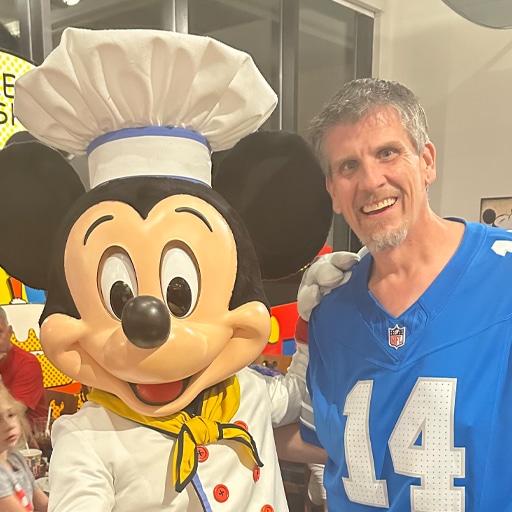
How many of you out there, love going from character to character in the parks and getting their signatures?  How many still get excited at a character dining waiting for that special guest to wander over to your table and sign your book and pose for a pic?  I admit, I love it.  It makes me feel like a kid all over again, but that is what Disney does for so many of us.

Something that amazes me about the autographs, whether it’s a live action character or a cartoon character the autograph is always the exact same.  Each Disney character that signs autographs has their own specific font that they sign in, and that font is a reflection of their character.  Graphology, is the study of handwriting.  The people who do this for a living say Graphology can say a lot about someone’s character, abilities and personality.

The Oh My Disney blog recently analyzed some of the different Disney characters signatures.  Keep in mind, the staff over at the Oh My Disney blog are not Graphologists, but using the internet they have come to the conclusion on some characters and I wanted to share their findings with all of you.

omd-blog-autographs-mickey-mouse-plain1
Mr. Mouse is the big cheese, and his confident strokes definitely show it. He doesn’t dot his “i” with a simple dot. He dots his “i” with a big, fat, loopy circle. Bold move, Mickey. But do you see how his letters are all about the same size? That means he’s humble (despite being so awesome). He also manages to write in all caps and not look like he’s yelling at us. Notice that Mickey doesn’t write in a straight line. That might mean something. Probably.
Minnie Mouse is the ultimate definition of feminine. Thorough research and analysis led us to count a total of four hearts, two sets of “XO,” one “love,” and an unknown number of kisses (Could it be infinite?! We may never know). Plus, Minnie loop-de-loops her L’s, O’s, D’s, K’s, S’s and M’s (Disclaimer: “Loop-de-loop” is not an official graphologist term…yet). Minnie’s clean cursive would make any elementary school teacher proud. A+, Miss Mouse.
Goofy needs a little help from his pal Mickey in the handwriting department. And spelling department. Props though for somehow making G-O-O-F-Y look like a number. His big, round O’s recall his outgoing personality, and his super slanted handwriting points to his general state of lovable frazzle. We can almost guarantee Goofy’s pencil broke immediately after he finished signing.
Rapunzel has really nice penmanship (Granted, being locked away in a tower for forever probably gave her plenty of time to perfect it). We’re guessing Pascal helped her decide how to do her Y’s and Z’s. The letters all lean slightly right, meaning Rapunzel is open to new experiences and meeting new people (See “being locked away in a tower for forever”). Her capital letters look suspiciously like her long locks of hair, which suggests her free-spirited personality. Do you think if we zoom in enough we’ll see a tiny, climbing, smoldering Flynn?
Whoa, Belle. Things just got fancy (in France-y). Belle must have read a more than a few books about beautiful handwriting, and all of that reading has certainly paid off. Here, we can see that Belle is a big fan of decorating her letters, suggesting high energy and enthusiasm. Her letters are pretty close together, which hints that she’s introverted (a.k.a., she likely has her nose stuck in a book). But just look at that elegant underline! Belle knows there must be more than this provincial life.
Hold on. No heart-dotted i’s? No fancy underlines? Tiana’s handwriting, unlike what we’ve seen from the other lovely ladies, is far from frilly. See how she crosses her lower case T’s toward the top? That shows her high self-esteem and optimism. Her letters are squished together and connected, which means this princess makes her decisions carefully — all fine qualities in a business owner, we’d say.
Vanellope’s autograph reminds us a lot of how our handwriting looked when we were first learning cursive. Uneven spacing. Inconsistent sizing. A little bit, dare we say, glitchy. But hey, cursive is hard for adults too, so kudos to her for writing legibly. Her handwriting is big and bold, meaning she’s confident on and off the racetrack. The letters all have rounded edges — a sign of artistic ability and creativity. After all, haven’t you seen the racecar she designed?


Leave a Reply

The Main Street Mouse