
“There are no rules for good photographs,
there are only good photographs.”― Ansel Adams

You know a poorly composed photo when you see it – like this one from the Rain Forest Cafe!
It’s too busy and cluttered; and it’s taken so wide that the subject (the snake) is lost in the photo. My eyes aren’t even sure where to look…is it the purple shirt, the people or the snake?? I really took this shot to crop in on the snake but I didn’t even like it cropped. It’s a good example of a baaaaad photo. If you have taken photos like this, with a few simple tips you can shoot better photos in no time!
This is BAD COMPOSITION! What’s the focal point?
Although there are no rules for good photographs, there are established guidelines of composition that can create a more compelling photo.
If you’ve spent any time on Flick’r looking at other photographers photos, you have probably noticed that some photos stand out more than others, and you are drawn into them… wanting to see more. Those photographs likely have strong compositions as their foundation.
I encourage you to do look at photos on Flick’r and take notice of what appeals to you about the image. Where is the subject in the image…is there something that leads your eye from one place to the next in the photo…what kind of lighting is there? I give you fair warning though…minutes can turn into hours looking at photos on Flick’r. There are a lot of great photographers on Flick’r who shoot at Disney and you’ll get inspired with their stunning and captivating images!
It takes more than just good composition to make a good photo, but poor composition can ruin a photo. So, think of composition as the foundation of a house. The house doesn’t look good just because it has a great foundation; but the foundation is an integral part of the house. We’ll narrow it down to just five simple guidelines to help you compose better photos!
1) RULE OF THIRDS or THE GOLDEN RATIO
The Golden Ratio, or phi – appears everywhere in nature… from the leaf arrangement in plants, to the pattern of the florets of a flower, the bracts of a pinecone, and in the nautilus shell. Artists, architects and designers have incorporated the Golden Ratio into their work for centuries, and compelling photos most always incorporate it too.
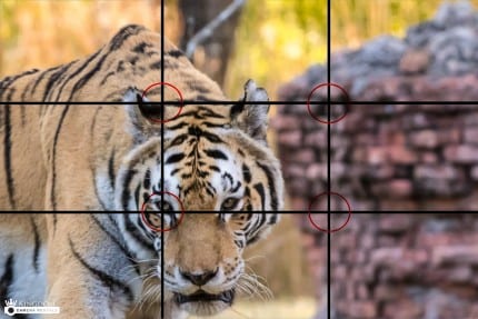
Think of a of a tic-tac-toe board. The most important elements of your composition should be placed along the left or right vertical thirds and/or the top and bottom horizontal thirds. I placed the tiger in the left vertical third of the diagram. In addition, the four intersections of these lines are called the “power points.” This is where a subject should be placed to give it emphasis, and it is here where the eye is automatically drawn.

The four intersections of these lines are called the “power points.” This is where a subject should be placed to give it emphasis; the eye is automatically drawn to the power points.
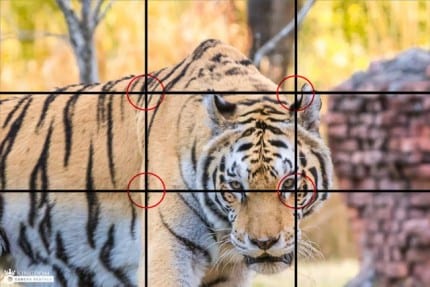
In the photo below I placed the tiger’s eye at one of these power points. The viewer’s eye is naturally drawn to the eye of the tiger. Personally, I prefer the image above even though the eyes are not at a power point. You don’t always have to follow this guideline and sometimes you shouldn’t. There are times when the focal point should be centered to achieve a balanced and pleasing look. But in general, the Rule of Thirds aka The Golden Ratio will help you achieve a balanced look.

2) GET CLOSER TO YOUR SUBJECT
This is a mistake I see when people first start shooting. They try to capture too much in the scene. Don’t do that. Decide what’s your focal point -then GET CLOSER… GET CLOSER… GET CLOSER. It’s almost a sure bet that the closer you get, the more compelling composition you’ll have! Your focal point should have sufficient prominence in the image. Even if your focal point is small, you can give prominence to it by composing empty space around it. If you have a secondary subject it should not compete with the main one.
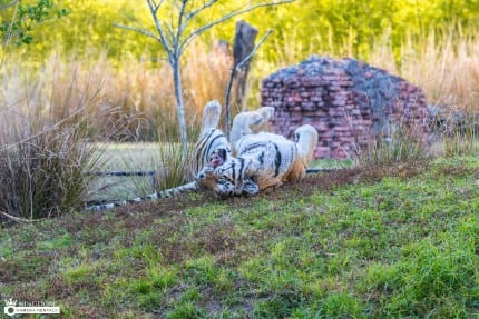
The image below is the original shot before cropping. My focal point, the frolicking tiger is dead center – not at all where he should be in the photo. There’s also too many distracting things and colors around him.
Get Closer! Don’t let your subject get lost in the image – like this.

The image below is my edited image. I zoomed in by cropping and put the tiger off center. Notice how the subject fills the frame? It’s important to fill the frame with your photos!
I like the wall in the background, but if I had left the entire wall, it would have competed with the tiger. This is a much more interesting photo than the original shot above! Photos of your kids will look much better if you move in close and capture all the details in their beautiful little faces!

3) HORIZON LINES
Oh I wish I had known this guideline when I first started shooting! Decide if your sky is more interesting or the foreground, and then put your horizon off center- giving preference to whichever is more interesting. The exception to that is with reflections;the horizon looks more balanced in the center with the elements mirrored equally, as I did in the photo below. Speaking of lines, make sure your subjects and horizon lines are straight – you can fix then in post processing. I cringe when I see some of my early photos of the castle and it’s slightly crooked like the Leaning Tower of Pisa.

4) FOLLOW THE LIGHT
There are entire photography books written about light so that tells you how important it is. It also tells you that I will barley touch on it here. The best time of day to shoot outside is in the morning before noon, or in later in the afternoon as the sun starts to set.When you’re on vacation you just have to shoot with what you have for the most part. The golden light of the morning and before sunset makes everything and everyone look better though so take advantage of it when you can.
I was specifically looking for light when I found this gorgeous scene at Kidani Village. It’s actually the view from the parking lot looking away from the resort. It looks like you’re in Africa though – and it doesn’t look the same at other times of day. The light made all the difference between a boring photo and a good one.

5) LEADING LINES
Leading lines lead your eyes through the image and sometimes even out of the image. These lines can be the main subjects of the image, or they can be used to lead your viewer to a specific area within the photo that is an important focal point. Disney’s Boardwalk has a lot of leading lines like the one in the photo above. In addition to straight lines, curves also make interesting compositions and lead the viewer’s eye throughout an image.

There you have it! The next time you are shooting, try using some of these guidelines and see how it changes your photos. Let us know if you found our tips helpful! Be sure to share your photos with us on our Facebook Page. If you have any questions please post them on Kingdom Camera’s Facebook page.
Next week we’ll look at shooting on one of the camera’s automated scene modes! You may be surprised at how good your photos can be using these modes.
Have Fun in Focus!
Lenise at Kingdom Camera Rentals
- D23 Asia Debuts in Singapore in 2027 - May 5, 2026
- Disney Lorcana Wilds Unknown Coming to World of Disney May 8 - May 5, 2026
- Papa Johns and Toy Story 5 Pizza Collab Announced - May 5, 2026

Mouse Fan Travel® an Authorized Disney Vacation Planner, has been planning and creating magical Disney vacations since 2005. Their mission is to provide premium service and expert advice to help you get the most for your vacation time and dollar. Their Disney Travel Agents operate with the highest degree of integrity and will handle your family vacation, reunion, honeymoon, corporate incentive trip or getaway, as if it were their own. They pride themselves on expertly representing and advocating for you – their client.
The next time you and your family are planning a Disney vacation, visit Mouse Fan Travel for your no obligation quote or to answer any Disney vacation questions you may have. Are you looking for a beach vacation, tour or cruise to destinations across the globe? Visit MEI-Travel for exceptional expertise with ZERO agency fees.


